A rebranding proposal for JBA Philippines
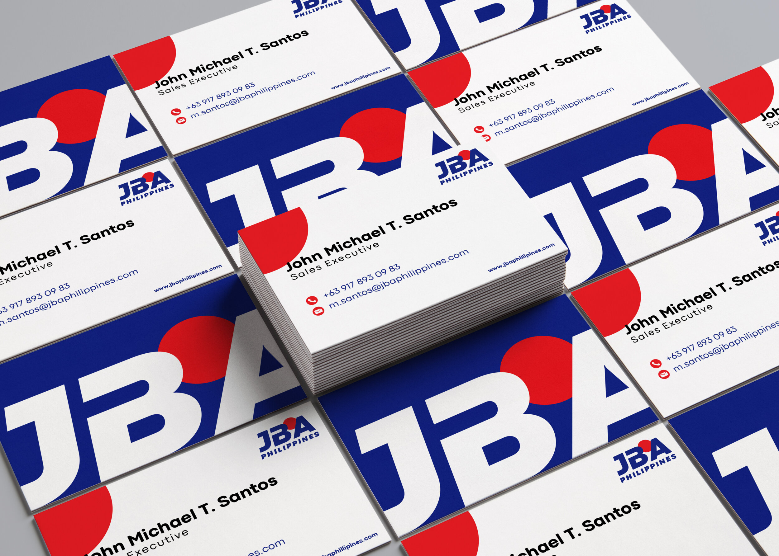
We want to incorporate values that we want to champion onto the logo by infusing it with a dominant blue—a color that primarily represents trust and stability. The red circle represents the sun which is an homage to the company’s Japanese roots.
The text is structured to be timeless with bold letters to connote a strong and established foundation. The slant treatment brings a forward motion to the whole image so represent that the company is always moving forward.
Agency: ADA Asia
Executive Creative Director: Kitty Torres
Copywriter: Ralph Manalansan

We wanted to roll it out in many different channels and materials.